Heat Map of COVID Cases in US Shows How Rampant Delta Is
That’s a whole lot of red.

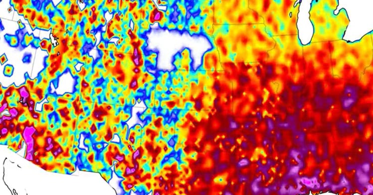
A new map published on Reddit leaves no questions about how widespread COVID-19 is across the United States, now more than a year and a half into the pandemic.
However, as the much more contagious Delta variant continues to spread, this map puts into perspective just how powerful and rampant Delta is compared to previous surges of the pandemic. Here’s what you need to know.
According to Digg, Reddit user u/notus_analytics uploaded an animated time-lapse map to r/dataisbeautiful. The map shows the number of reported cases of COVID-19. It is tracking from the beginning of the pandemic in January 2020 to today in a heat map form. And, honestly, it’s startling.
As the timeline moves forward, we can see the colors change across the country. The colors represent the active COVID-19 cases per capita using data collected from New York Times, US Census Bureau, and Zip Code numbers, according to notus_analytics’ citations.
The white and blue colors signal lower numbers of active cases that move higher as we get into blue, yellow, orange, and red and purple colors representing more significant numbers of active COVID-19 cases per capita.
Starting in January and February 2020, we see the map mostly white, showing there are very few, if any, cases. Then as the animation hits March, blue dots start to appear across the country, with some darker colors popping up around Florida. Finally, there are far fewer white areas and more deep blues when April rolls around, with other pockets of more extensive spread in the New York and Louisiana areas.
The map changes color again in July 2020, with nearly the whole southern states in yellow, orange, and red clusters. And a few already showing the highest purple colors. Then, by November 2020, the entire country is red, with some northern states highlighted in purple. And it’s even worse by the end of 2020.
When the animation circles to March 2021, the map looks hopeful, moving away from the brighter reds; more of the western states are highlighted in blue, which spreads to the eastern states in June, where the whole map is close to blue. This is due to the vaccination campaigns that initially drove down Delta cases precipitously, but as vaccine rates stalled and Delta hit the United States, the map changes again.
By July 2021, the map shifts to the brighter colors signaling more cases per capita. Then, the southern states turn yellow, red, and purple as the timeline changes into August 2021.
The map is both a reminder of how far we’ve come and how far we have yet to go.
This article was originally published on