This Extreme Weather Tool Is Legit Terrifying (and Really Useful)
See how you county matches up against the rest of the country when it comes to the warming climate.

The weather is one of the more impactful yet unpredictable parts of our daily lives. That’s why USA Fact has tracked the weather in all counties in the United States (excluding Hawaii and Alaska) for your perusal — especially if the warming climate is something you think about daily. And to really make it convenient, they even created a bunch of maps to give people a better idea of what areas have unusual trends in weather.
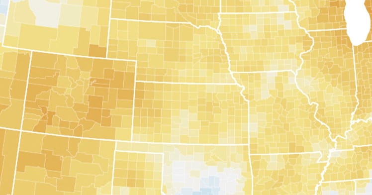
The interactive maps allow you to look at specific counties in terms of both temperature and precipitation, so you can see how your own county is comparing to previous years in both categories.
The data for October is not yet available, but you can see every month of 2021 up until September to get an idea of both local and national climate trends. There is even a map that lets you see which specific counties have experienced shifts in temperature and precipitation that are considered extreme in comparison to the weather in the same areas over the 20th century.
In July, pretty much everywhere west of the Rockies was hit with extreme heat, and a few counties in inland California and Arizona even experienced a wet hot American summer.
But by September, that had leveled off a bit and the heat moved to the East Coast, leaving 97 million people in a county “where temperature, precipitation, or both temperature and precipitation was different than the 20th century average for September.” Overall, 11 percent of counties in the US experienced temperatures above the 20th century normal in the month of September, with no counties experiencing temperatures below last century’s average.
In terms of precipitation, things have been slightly less extreme overall, though there has been a general uptick in the amount of rain the country has experienced. In September, 6 percent of counties in the US experienced precipitation above the 20th century normal, with no counties experiencing temperatures below last century’s average.
The tool is great for families who are considering where to spend out the rest of their lives. Obviously, temperature and climate — and how those things are changing, year over year — have already begun to play a big part in people deciding where they live. And whether you are considering a move or simply want to see whether or not your own home county is shifting in terms of both temperature and precipitation, this data can help you get an idea of whatever you are looking for all across the country. You can check out the interactive maps here.
This article was originally published on