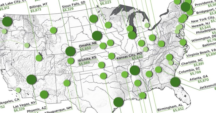
This Map Shows What $100K Salary Is Worth Across the United States
100k goes a long way, but most people will never make that in their lives.

The merits of the Trump administrations landmark tax bill are still up for debate. There is a contingent of Republicans who believe that the middle class will benefit from the changes a great deal. On the other hand, there are folks across the aisle who point out that the super-rich are the only ones who will reap long-term benefits form the bill. Now a new map from How Much, an organization aimed at helping people understand their money, is showing the monthly take-home pay of a person making a $100,000 salary in the biggest city of all 50 states.
The map accounts for state and local taxes when they apply, and has also factored in unanimous fees that everyone is supposed to pay like income tax. By using those in the upper echelon as the middle class as a baseline, you can get a sense of how trying it could be for anyone who has to live below that. The ten cities in which people earning $100,000 a year have the lowest take-home pay each month are as follows.
- New York City, NY: $5,574
- Portland, OR: $5,663
- Louisville, KY: $5,691
- Baltimore, MD: $5,701
- Honolulu, HI: $5,726
- Philadelphia, PA: $5,746
- Los Angeles, CA: $5,752
- Boise, ID: $5,772
- Wilmington, DE: $5,791
- Detroit, MI: $5,797
What’s interesting about this list, is that three of the five places where $100,000 a year wouldn’t be enough for a home are actually taking home the least. Seattle, WA; Cheyenne, WY; Las Vegas, NV; Anchorage, AK; Houston, TX; Jacksonville, FL; Memphis TN; Sioux Falls, SD; Manchester, NH; and Fargo, ND make up the top ten in terms of take-home pay. That pay comes out to $6,329 a month in all 0f these cities except Fargo where it’s $6,199 a month.
howmuch.net
Okay, so the elephant in the room is that most people in the U.S. don’t make close to $100,000 a year. If that were the case, then the median income wouldn’t be around $59,000. While $100,000 is still a bit of an outlandish figure, the map is based on the largest cities in each state, and it stands to reason that the largest cities do generate the most capital. Regardless, the map does do a good job of illustrating just how much where you live is linked to your success under certain economic policies. And, as the tax landscape evolves in the coming years, it’s good to know what trends are changing and which ones aren’t.
This article was originally published on